As the end of summer break swiftly approaches, I have been approaching Swift!

That was a truly awful attempt at wordplay—and I already regret the decision to stick with it as my opening sentence—but it’s also rather accurate.
For what is likely to be my final major project of the summer, I decided to try my hand at iOS/watchOS programming.
The Background
While I have had a definite fondness for (and occasional obsession with) computer programming since at least 6th grade, I’ve mostly gravitated more recently towards web development. I think it’s because I tend to get overwhelmed by all the low-level finicky stuff required to interact with operating system APIs and actually display things, graphically, on a computer screen.
For example, here’s some sample C++ code, straight from the Microsoft developer docs, for creating an empty window in, you guessed it, Microsoft Windows:
// Register the window class.
const wchar_t CLASS_NAME[]  = L"Sample Window Class";

WNDCLASS wc = { };

wc.lpfnWndProc   = WindowProc;
wc.hInstance     = hInstance;
wc.lpszClassName = CLASS_NAME;

RegisterClass(&wc);

// Create the window.

HWND hwnd = CreateWindowEx(
    0,                              // Optional window styles.
    CLASS_NAME,                     // Window class
    L"Learn to Program Windows",    // Window text
    WS_OVERLAPPEDWINDOW,            // Window style

    // Size and position
    CW_USEDEFAULT, CW_USEDEFAULT, CW_USEDEFAULT, CW_USEDEFAULT,

    NULL,       // Parent window
    NULL,       // Menu
    hInstance,  // Instance handle
    NULL        // Additional application data
    );

if (hwnd == NULL)
{
    return 0;
}

ShowWindow(hwnd, nCmdShow);
And here’s some HTML and CSS for displaying some text inside a rectangle on a web page:
<div style="border: 1px solid black"><p>Hello World!</p></div>I’m definitely a detail-oriented person (some might say a perfectionist), and I love learning the intricacies of how things work. But when it comes to creative endeavors, I’m much more drawn to the big picture or overall concept of things—schemata, gestalts, and all that jazz. In other words, I love contemplating what a thing should look like, do, and mean, but building all the little pieces of a thing can sometimes drive me nuts.
This is also, incidentally, why unit planning is my least favorite aspect of teaching.
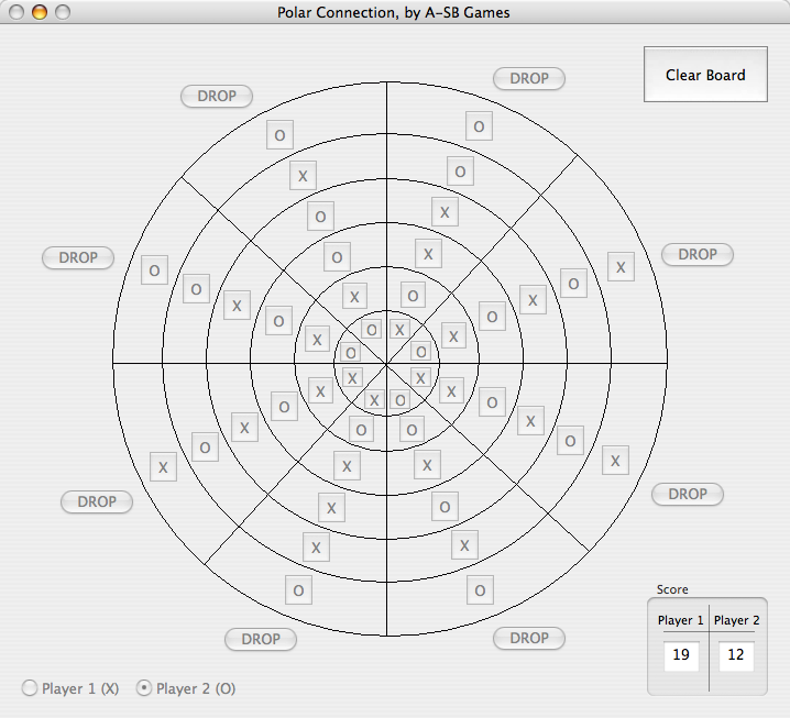
So, for the reasons illustrated above, on the few occasions when I did attempt to create native apps, I focused on platforms that let programmers literally draw an interface using a palette of tools, kind of like what you might see in Photoshop or even MS Paint. When I was in high school, I used one such platform, Visual Basic, to build a four-in-a-row game played on a circular board (instead of rectangular).
It featured local and network multiplayer support, an optional computer opponent, and even separate apps to create and manage game servers. Visual Basic only worked in Windows, so I eventually learned how to use Apple’s similarly-minded Interface Builder alongside the Java programming language, which I learned in a few of my college CompSci courses, to create a Mac version of the game.
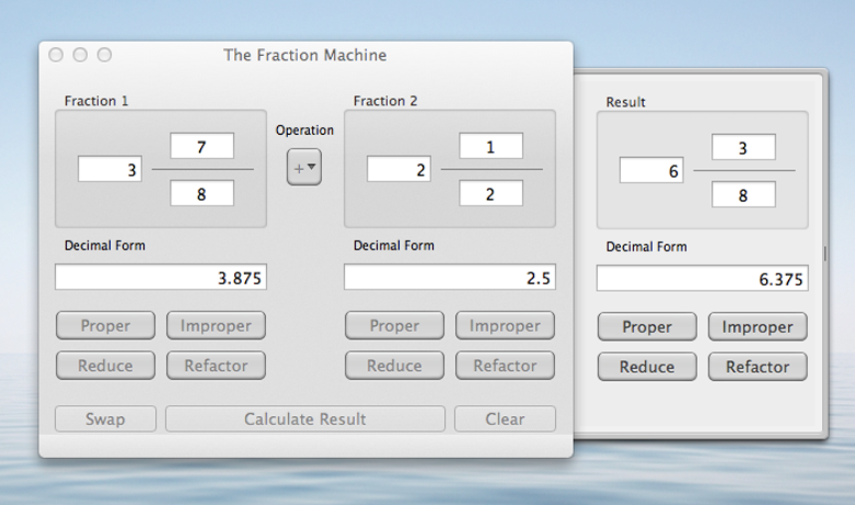
Unfortunately, several years later, Apple deprecated and ultimately dropped support for native Java apps. So then I taught myself the bare basics of Objective-C, Apple’s preferred language. I built exciting apps like the Fraction Machine…
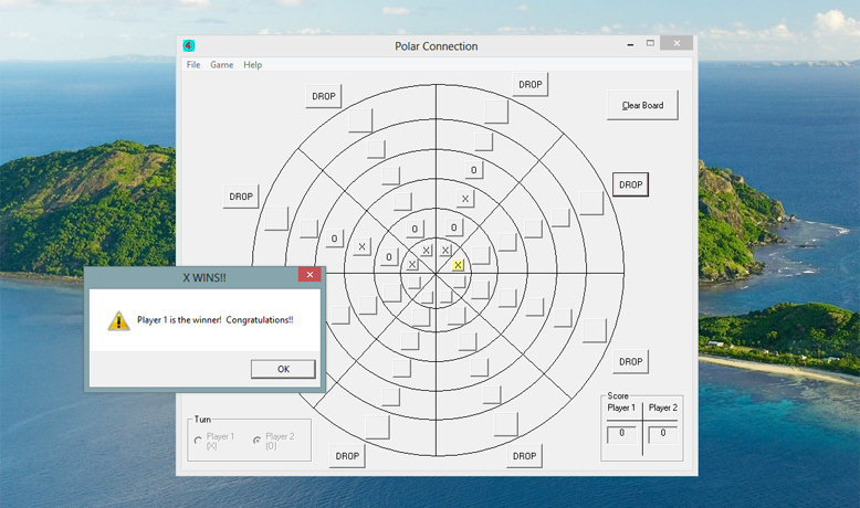
…and a phone-based four-in-a-row game called Rotational Connection…
…but I ultimately found Objective-C and Apple’s “Cocoa” API really cumbersome to work with. You had to spend so much time focusing on architectural things like “retaining” and “releasing” variables so that the memory allocation/deallocation scheme would work correctly. (Apple eventually built an automatic memory management system, but this was long after I’d given up.) And even though I understood things like pointers and variable dereferencing conceptually, they still kind of made my head hurt. And did I mention Objective-C’s weird bracket-based syntax?
I eventually moved on from native apps altogether.
Even though web development also often requires getting into the weeds, I’ve always found PHP, HTML, and CSS to be pretty straightforward languages. I’ve also done a lot of my work in systems that provide you with templates, hooks, and filters that you can plug your code into so that you don’t have to write everything from scratch.
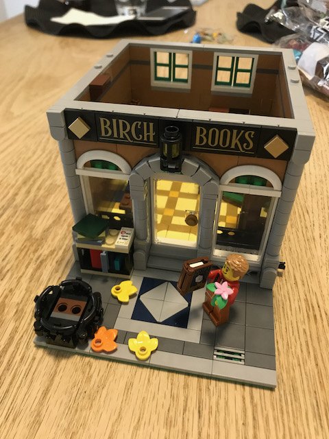
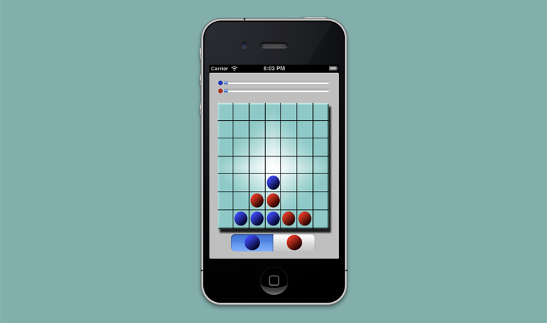
A major exception, however, where I did create a web app from the ground up was Inventory Box, the classroom equipment checkout system that I wrote about here.
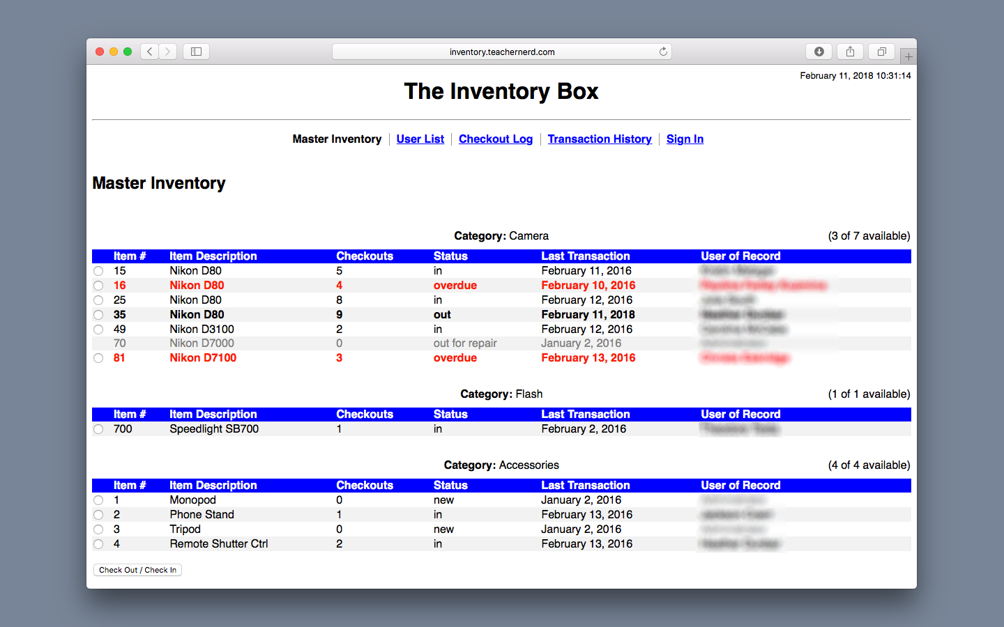
The first version was written mostly in PHP, and all it really did was output a bunch of HTML. And the thing about HTML is that it is, by design, imminently readable and understandable. It’s a semantic markup language, which means HTML documents basically describe themselves as they go. Things get more complicated when you bring CSS stylesheets into the picture, but even at their most obtuse, they’re still largely descriptive in nature: I want this box to be this wide, that one should be invisible, that one should be pink, and so on.
In my opinion, the point at which web development gets really complicated (a bit more like native app development) is when you bring JavaScript into the equation. Whereas PHP (and other server-side scripting languages like Ruby or Python) allows a web app to do some thinking before sequentially sending HTML or other data to the browser, JavaScript allows you to manipulate data and designs after they’ve been spit out by the browser. It allows the content on pages to move, be updated incrementally, and respond in interesting ways to user interaction.
It’s incredibly powerful, but JavaScript had always felt to me like the least left-to-right/top-to-bottom/this-goes-here aspect of web development. I also just found JavaScript code hard to read. (Parentheses, braces, and anonymous functions EVERYWHERE!!!) Consequently, I tended to avoid it—until it became increasingly clear that this is just how the modern web works and I needed to either understand it or stop pretending to be a developer. So, as I detailed in my earlier blog post, I decided to rewrite Inventory Box from the ground up using JavaScript to power the entire front end interface.
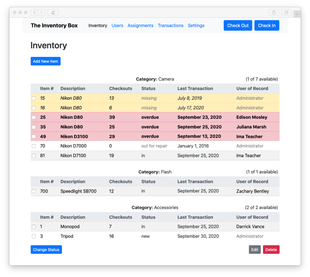
More specifically, I decided to try out a JavaScript framework called Vue.

Just like all the back-end frameworks I’ve worked with, Vue’s trick is to do a ton of the heavy lifting for you, but on the front end. It uses what’s known as a “declarative” programming style as well as a development architecture known as MVVM (Model-View-ViewModel).
What that means, more or less, is that you use code to separately describe (i.e. declare) how you want the app to work—what form the data should take (the Model), what it should look like when presented on screen (the View), and the “logic” behind how data gets from storage to screen and vice versa (the ViewModel). The framework itself does the complicated part of actually shuttling the data back and forth between the three components.
And, as it turns out, if you throw in the semantic clarity of HTML plus a predesigned library of front-end components (of which there are many to choose from) to create your views, you rarely have to think about the low-level finicky stuff. You can build a sophisticated app from scratch but still be able to (mostly) focus on the gestalt!
And that (finally) brings me to Swift along with its cool but slightly awkward younger cousin, SwiftUI.
The Problem
About seven years ago, Apple introduced a brand new programming language to the world.
Called Swift, its goal was to solve a lot of problems that its developers saw in “legacy” languages like C and its derivatives (including, significantly, Objective-C, which had been Apple’s language of choice for decades). You can still use these languages to code on Apple platforms, but Apple really wants new developers to learn Swift.
To that end, Apple released its very own declarative user interface framework for Swift in 2014. While it is said to not yet be as mature an API as its predecessor, Cocoa, Apple has nevertheless touted it as the future of cross-platform development in its ecosystem.
Did you notice I referred to SwiftUI as a “declarative” framework? Ring a bell? As it turns out, SwiftUI is very much also extremely well-suited to the MVVM architectural model that I discovered when rewriting Inventory Box.
I’m not exactly sure when or why, but at some point I recognized this connection and subsequently realized that if I could build a somewhat complicated web app using a declarative, MVVM-based programming approach, maybe I could build a really simple computer app in the same manner! Perhaps I could finally put my discomfort with native device programming to rest.
And I even had the perfect project in mind to put this theory to the test!
The Objectives
Several years ago, probably some time after Apple started allowing developers to add custom “complications” (i.e. information gauges and displays) to the Apple Watch, I had an idea for an app.
I was an Apple Watch user myself, so wouldn’t it be cool, I thought, if there were a complication that could tell me at a glance how much time was left in whichever class I was currently teaching?
I recall briefly indulging this curiosity. However, I must not have gotten very far (presumably due to the reasons described above), for there is no longer any record of these efforts on my computer.
Yet as I counted down the days until the 2021 school year would begin, I thought to myself, maybe I know just enough more stuff and maybe Apple’s tools have improved just far enough that it might just be possible to finally pull this off without pulling my hair out of my head.
Here’s how I wanted this solution to work:
- I should be able to use a phone app to create a list of class periods, including course names and their start and end times.
- I should be able to use that same app to program in my school’s block schedule. (In other words, there should be an easy way to tell it which periods/classes meet on which days.)
- Somehow, my iPhone should be able to send all of this information to my Apple Watch.
- At any given moment, the Apple Watch should be able to tell me (with minimal user interaction) what period is in session and how much time is left before the bell rings.
The idea here was to make it as seamless as possible to keep track of class time so that I could more easily and fluidly make adjustments to my instruction. Sure, I can always just look at my watch or the wall clock, check the time, and use that to figure out how many minutes are left, but that requires (1) remembering what time the class actually ends and (2) doing some mental math. You’d be surprised how difficult simple things like that can be in the middle of class when your brain is in 50 different places at once!
There was also one other really important parameter for this project: Because I do actually have to prepare for the school year, I needed to be able to learn Swift and complete the app in under a week.
The Solution
Let me start this section by saying I did manage to create a class-tracking app. It’s called (drum roll, please…) Classified, and its icon looks something like this:
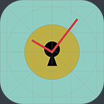
(I may be a reckless punster, but an artist I am not. In case you can’t tell, that’s supposed to be a pair of watch hands on top of a sort of old-school keyhole-looking thing. Because, you know, the contents are…classified. I also apparently forgot to remove the guidelines from the template, but I think I’m just going to leave it like that. I spent about 5 minutes on this beautiful creation, and that’s all the time I’m willing to give it.)
Learning the Ropes
So, back to app-making.
The first step, as always, was to do some research. I needed to figure out two things: does SwiftUI really make it as easy to build apps as Apple claims, and how does Swift even work?
Probably the most useful resource I found was, unsurprisingly, the official Swift documentation. It’s well organized, written clearly, and features just enough example code to ensure that a newbie can understand what the heck is going on. Already having a decent background in this stuff surely helped; if I were completely new to coding, something like an online course would have been much more useful.
Another cool site I came across was Hacking with Swift. Among its offerings are the sort of online courses I mentioned above, but it also has lots of articles that briefly (with examples) explain various aspects of Swift programming.
I also kept coming back to this article about binding user interface elements to centralized data stores from the fabulously named LearnAppMaking.com.
And of course, there’s the Apple Developer Documentation. It’s an invaluable source of information, but there’s one thing that always drives me crazy about it. I always feel like whatever page I’m reading gives me just enough information to kind of understand something, but the moment I try to actually start doing it, I realize I still know nothing—until I do a whole bunch of Googling and scraping of the internet for the missing pieces. Nevertheless, it gets a shout-out too, especially because I did find some of Apple’s sample apps very helpful.
Putting It Together
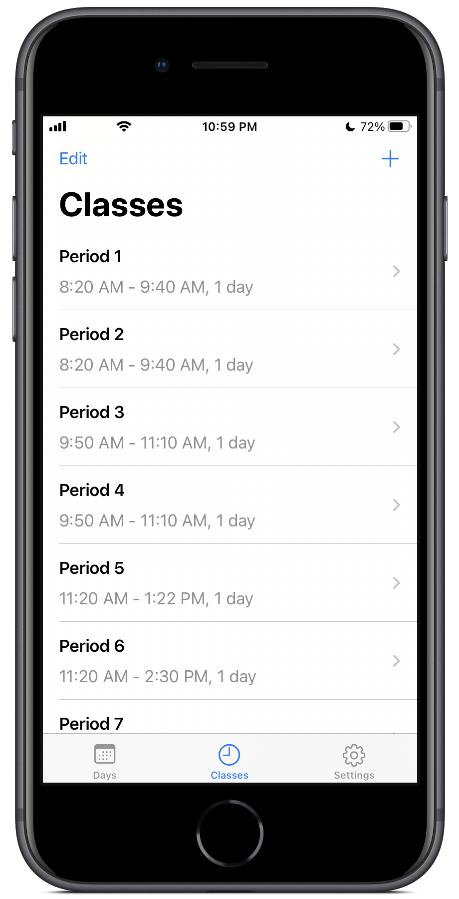
Once I’d done enough homework to get started, well, I started! There was, of course, plenty more reading and research to be done along the way, but after a couple days, I finally had something to show for my work.
The app met most of the objectives: I could program in a schedule on my phone, send it to the watch by tapping a button in the bottom toolbar, and view the current period’s countdown on the watch app. What it couldn’t do was show this countdown as a complication directly on the watch face. The phone app was also kind of messy looking.
So after taking a break for a day or so, I got back to work. This time, I was determined to make my app look much more like a “real” iOS app. I studied the user interface of some of Apple’s first-party apps as well as a few others on my phone. I even read some of Apple’s Human Interface Guidelines.
A Second Attempt
I ultimately settled on a tab-based interface and decided to put the actual settings for each school day and class period in a separate navigation pane. This made it easier to see each list at a glance, and it eliminated the need for a kludgy workaround to solve an issue related to out-of-bounds array indexes when deleting entries. I was also able to use the standard “+” button for adding new items. The one downside was that I had to relegate the “Send to Watch” button to its own tab. (In a future version, as soon as I figure out how to get background data transfers to work correctly, I should be able to eliminate the button altogether.)
Here’s a breakdown of how it all works.
Days
You start by programming in each school day:
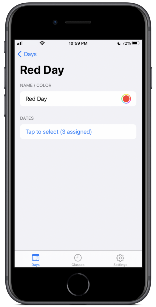
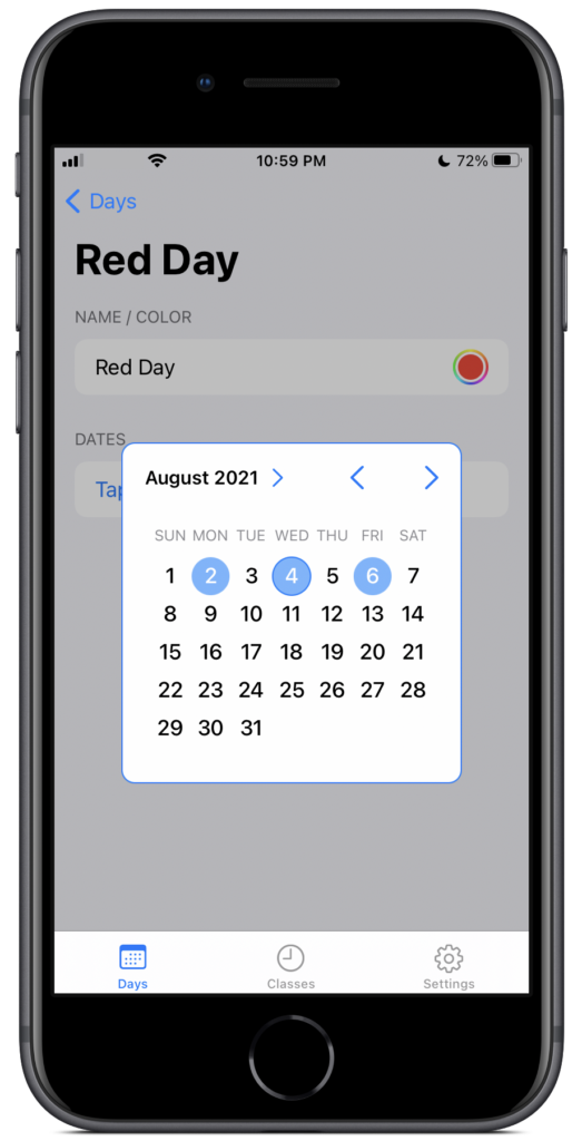
You give each day a name (at my school, we call them Red Days and Blue Days) and, optionally, a color. You then tap a button which pops up a calendar that lets you select a bunch of dates to assign that day to. This is a little tedious, but it ensures that the app conforms exactly to the school’s block scheduling system.
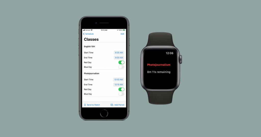
Classes
The next tab lets you create a list of classes:
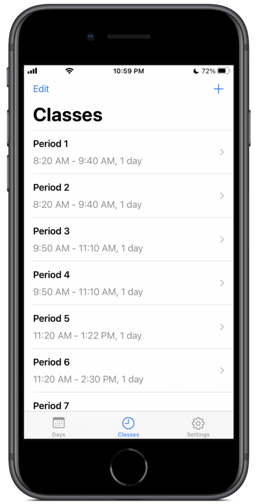
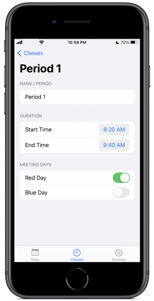
In the example, I have them named by period, but you can also use the actual course names. Each period needs a start time and end time. And then, there’s a set of on/off toggles, one for each type of day created in the previous tab. This lets you tell the app which class periods meet on which days. At my school, we rotate back and forth, with even periods meeting one day and odd periods the next. But for many years, we had one shorter period that met at the same time every day. By using the toggle switches, this app is able to accommodate that!
Settings
The final tab contains the aforementioned “Send Schedule to Watch” button, which does exactly what it says:
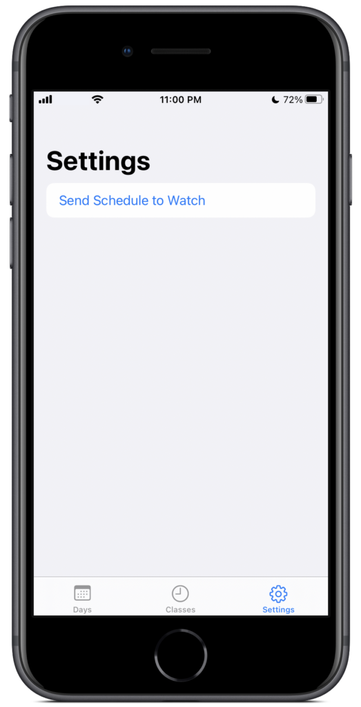
The one caveat is that the watch app must be opened and active in order for it to receive the schedule. (There’s supposed to be a way to send data where the message sits patiently in a queue until the watch app opens, but I couldn’t get it to work. I’ll try again at some point.)
Watch App
The watch app is very simple:
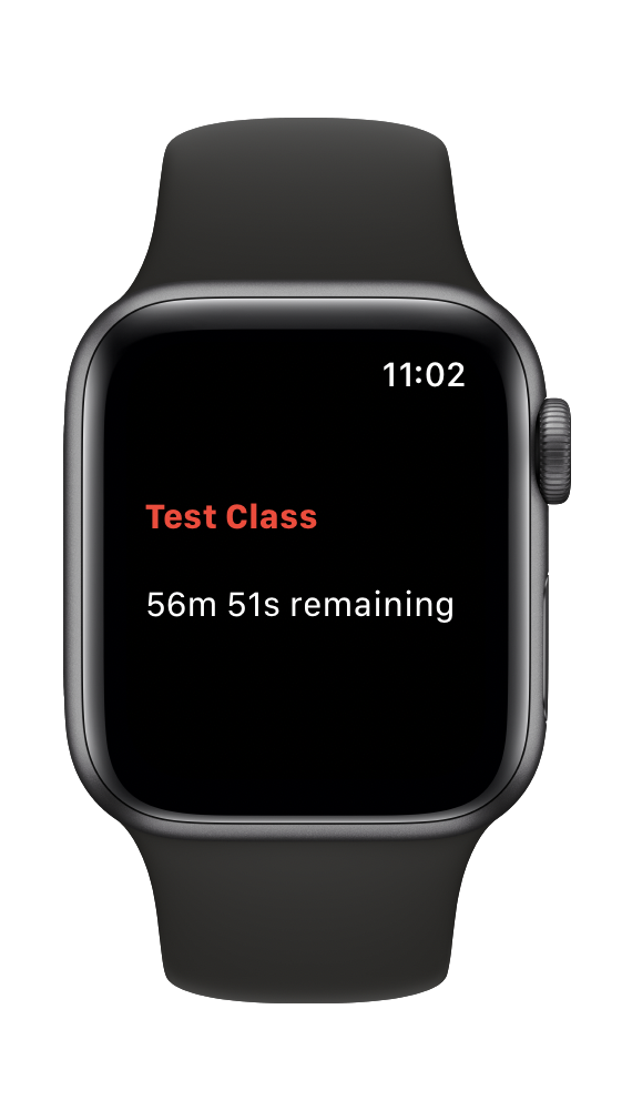
There are no buttons or anything to handle user interaction. It simply examines the current date, figures out what kind of school day it is (if any), and then shows you what class (if any) is supposed to be meeting at the current time. If a class is indeed in session, it also displays a countdown timer indicating when the period will end.
Complication (and Frustration)
The final piece of the puzzle is the watch complication:
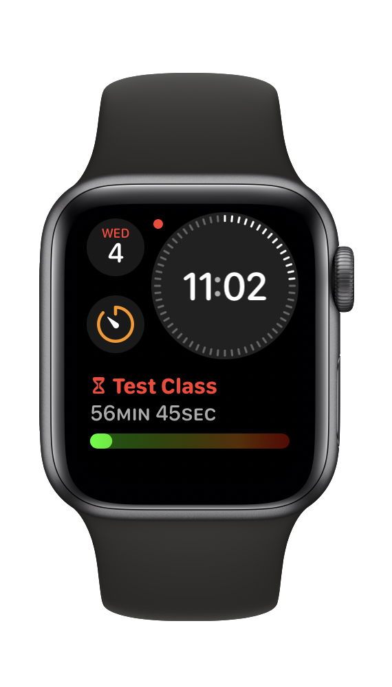
I’ve created two versions so that it’s compatible with a few different watch faces. The one you see above displays the name of the current class, color-coded by the type of day (as configured in the phone app), followed by the all-important countdown and a cool gauge that gives you a visual representation of the elapsed time. (The gauge turns more and more reddish in color as it reaches the end of class.)
Ironically—or maybe not—creating the complication proved to be the hardest part of this project.
The way complications work is that the app they belong to must provide the watch with a series of “timeline” entries that describe, by way of templates and data sets, what the watch is supposed to display at different moments throughout the day.
The method is kind of ingenious. By forcing apps to “pre-cache” the data instead of continually updating the display, Apple significantly reduces the amount of work the hardware has to do. Ideally, a well-designed watchOS app will only calculate the minimum number of entries necessary for the complication to work correctly and, in turn, this means much less drain on the relatively small battery that Apple has to cram inside their computer-on-a-wrist.
As sensible as the mechanics may be, I struggled for hours to get the watch to update the timeline whenever the app received new data from the phone. I finally had a breakthrough—in my head, anyway—mere moments after laying down to go to sleep, a good reminder that sometimes the best way to solve a problem is to just walk a way from it for a bit. Sure enough, when I woke up the next day and tried out my new solution, it worked!
The final sticking point was getting the watch to queue up the next day’s worth of timeline entries. (The way my code works, the complication controller is only able to examine and cache the current day’s schedule.) After a little more tinkering, I was able to solve this dilemma by tapping into Apple’s background refresh process to request a timeline update every day at midnight.
The Outcome
So, what did I learn from this endeavor?
Well, I think the biggest takeaway is that it has gotten a lot more convenient to create an app in the Apple ecosystem. In my opinion, Swift is a lot simpler to use and understand than Objective-C and its predecessors. And SwiftUI is also surprisingly easy to use. While the format and structure may look very different, coding with this framework felt almost as straightforward as creating a web page with HTML and CSS.
Here, for instance is all it took to describe the entire class period editing screen in the phone app:
struct PeriodEdit: View {
    @Binding var period:ClassPeriod
    var days:[SchoolDay]
    var index:Int

    var body: some View {

            Form(content: {
                Section(header: Text("Name / Period")) {
                    TextField("Class Name (e.g. Period \(index + 1))", text: $period.name)
                }

                Section(header: Text("Duration")) {
                    DatePicker(
                        "Start Time",
                        selection: $period.startDate,
                        displayedComponents: [.hourAndMinute]
                    )
                    DatePicker(
                        "End Time",
                        selection: $period.endDate,
                        displayedComponents: [.hourAndMinute]
                    )
                }

                Section(header: Text("Meeting Days")) {
                    ForEach(0..<days.count, id:\.self) { j in
                        Toggle(isOn: $period.relDays[j]) {
                            Text(days[j].name)
                        }
                    }
                }
            })
            .navigationBarTitle(period.name == "" ? "Period \(index + 1)" : period.name)
    }
}
I thought the absence of a WYSIWIG (what-you-see-is-what-you-get) interface builder would be a real drag, but Xcode (Apple’s IDE, short for Integrated Development Environment—the app you do your coding in) offers a drag-and-drop palette of code starters for many of its view components and, most importantly, interactive live previews. This means you can craft and refine the appearance of your app without having to write a ton of arcane code and see exactly what you’re doing while you do it. Color me impressed!
Of course, I was by no means pushing SwiftUI to its limits, and coding the “ViewModel” did require a bit more effort, but if you’re trying to develop a quick-and-dirty solution to some sort of mobile computing problem, Apple’s newest tools really do make the process far more approachable now than it ever felt to me before.
Perhaps the biggest letdown in this whole experience is that I can’t really share the app with my colleagues unless I’m willing to fork over $99 to join Apple’s official developer program. Without a paid annual subscription, you can’t distribute an app on the App Store, share it via Test Flight (Apple’s solution for sending apps to beta testers), or even tap into its lesser-known system for distributing private “enterprise” apps.
At the very least, I will have an exciting, custom-designed class time tracker on my wrist. Surely, my instructional pacing will never be the same!
That said, I still reserve the right to pace around my classroom. (Sorry, I had to fit in one more awful pun.)